Unity Colour Picker
27 May 2019
I am going to show you how to create a HSV colour picker inside of Unity. It’s going to explain why I use HSV; how to set up the UI controls; and how to set up the scripts for it to work.

Colour Model
So why did I decide to use HSV instead of RGB? HSV stands for Hue Saturation Value and it was designed with humans in mind.
From a user perspective it’s really unintuitive to select colours using red, green and blue. HSV was developed to make it easier for users to select colours.
Hue basically represents the colours of the rainbow. Saturation changes how light the colour is, and value changes how dark the colour is.
Hue Slider
Creating the hue slider is fairly simple. All you have to do is add a slider to the scene from the UI section of the GameObject menu. Then name the slider “Hue Slider”.
To make the slider vertical you will need to select the slider and go to the Direction drop down menu. Select “Top To Bottom” from the menu to make the slider vertical.

In the hierarchy expand the slider to show its children. Delete the Fill Area and set the Background image to the image above. You will also need to adjust the Handle Slide Area to fill the whole container.
Saturation & Value Selector
The saturation and value selector is a little more complicated since we need to build our own UI object. We will be creating a slider that works in two dimensions. It should end up looking something like the image below.
We will start by creating the layout in the hierarchy. Create a panel named “Saturation Value Slider” and delete the image component. Then set its width and height to 256.
Refer to the following image when creating the other objects.
Background Panel
Create another panel and name it “Background” and set it as the child of the Saturation Value Slider panel. Resize this panel so it fills the parent container.
Go to the image component of this panel and remove the source image. Select the colour and change the alpha value to 255. This panel will be used to update the colours.
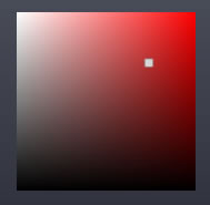
Gradient Panel

Next create another panel and put it below the Background panel. Name this panel “Gradient” and use the above image as the source image. Also make sure to set the colour so the alpha is 255. This image is used as an overlay to display the varying colours that can be selected.
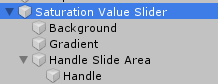
Handle
For the handle we will need to create a panel for it to move inside. This panel will keep the handle inside the sliding area. So create a new panel and name it “Handle Slide Area” and place it below the Gradient panel as show in the hierarchy image.
You will also need to keep the image component and set the alpha to zero. Make sure the panel takes up the entire space of the parent container otherwise the handle will have a limited range. Lastly you will need to set both the x and y pivots to zero.
We will also need to create the actual handle that will display where the slider is. Create another panel called “Handle” and set it as the child of “Handle Slide Area”. Set the width and height to 15.
The Script
Now that we have created the UI elements, we can now start creating the script. Create a new C# script called “SliderArea” then copy and paste the following code into that script.
This script basically moves the handle around when you drag your mouse over the box. It also lets you retrieve a Vector2 value that represents the position of the handle.
using System.Collections;
using UnityEngine;
using UnityEngine.Events;

public class SliderArea: MonoBehaviour
{
    public RectTransform Handle;
    public RectTransform Area;

    float Width;
    float Height;

    public UnityEvent onValueChanged;


    // Start is called before the first frame update
    void Start()
    {
        if (onValueChanged == null)
            onValueChanged = new UnityEvent();

        Width = Area.rect.width;
        Height = Area.rect.height;
    }

    public Vector2 Value()
    {
        float x = 0;
        float y = 0;
        Vector2 returnValue;

        x = Handle.localPosition.x / Width;
        y = Handle.localPosition.y / Height;

        returnValue = new Vector2(x, y);

        return returnValue;
    }

    IEnumerator Drag()
    {
        Vector2 currentValue;
        Vector2 prevValue;

        while (Input.GetMouseButton(0))
        {
            prevValue = Value();

            Handle.position = Input.mousePosition;


            if (Handle.localPosition.x < 0)
            {
                Handle.localPosition = new Vector3(0, Handle.localPosition.y, Handle.localPosition.z);
            }else if(Handle.localPosition.x > Width)
            {
                Handle.localPosition = new Vector3(Width, Handle.localPosition.y, Handle.localPosition.z);
            }

            if (Handle.localPosition.y < 0)
            {
                Handle.localPosition = new Vector3(Handle.localPosition.x, 0, Handle.localPosition.z);
            }
            else if (Handle.localPosition.y > Height)
            {
                Handle.localPosition = new Vector3(Handle.localPosition.x, Height, Handle.localPosition.z);
            }

            currentValue = Value();
            bool valueChange = currentValue.x != prevValue.x || currentValue.y != prevValue.y;
            if (valueChange)
            {
                onValueChanged.Invoke();
            }


            yield return null;
        }

        yield return null;
    }

    public void MouseDown()
    {
        StartCoroutine(Drag());
    }
}
Add the SliderArea script to the Saturation Value Slider panel. Then drag and drop the handle into the Handle value and the Handle Slide Area into the Area value, like the image below.

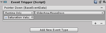
For it to work you will also need to create an event trigger component on the Handle Slide Area panel. Add a new pointer down event. Drag and drop the Saturation Value Slider onto the event trigger as shown below. Then select SliderArea.MouseDown from the drop down menu.
Colour Display
The colour display will be a box that shows the currently selected colour. All you need to do is create a new panel and name it “Colour Display”. Set the alpha to 255 so it’s not transparent. You can position it wherever you want and make it any size.
The colour picker should now look something like this. I have altered the appearance of mine to fit in with my UI so yours will look a little different. Next we will get all the components working together.
Colour Picker Script
Now we can put all the different components together to create the colour picker. Create a new C# script named “ColorPicker” then copy and paste the following code.
using System.Collections;
using System.Collections.Generic;
using UnityEngine;
using UnityEngine.Events;
using UnityEngine.UI;

public class ColorPicker : MonoBehaviour
{
    public SliderArea SatValSlider;
    public Slider HueSlider;
    public Image DisplayColor;
    public Image SVDisplayColor;
    public Color Color;
    IEnumerator coroutine;

    public UnityEvent onValueChanged;

    // Start is called before the first frame update
    void Start()
    {
        if (onValueChanged == null)
            onValueChanged = new UnityEvent();

        UpdateColor();
    }


    void UpdateColor()
    {
        Vector2 satValValue;
        float hue;
        float saturation;
        float value;


        satValValue = SatValSlider.Value();
        hue = HueSlider.value;
        saturation = satValValue.x;
        value = satValValue.y;

        Color prevColor = Color;

        Color = Color.HSVToRGB(hue, saturation, value);

        Color currentColor = Color;

        bool valueChange = currentColor.r != prevColor.r || currentColor.g != prevColor.g || currentColor.b != prevColor.b;
        if (valueChange)
        {
            onValueChanged.Invoke();
            DisplayColor.color = Color;
            SVDisplayColor.color = Color.HSVToRGB(hue, 1, 1);
        }
    }

    void OnEnable()
    {
        SatValSlider.onValueChanged.AddListener(delegate { UpdateColor(); });
        HueSlider.onValueChanged.AddListener(delegate { UpdateColor(); });
    }


    void OnDisable()
    {
        SatValSlider.onValueChanged.RemoveAllListeners();
        HueSlider.onValueChanged.RemoveAllListeners();
    }
}
Now we will want to add the script to the scene. Create a new panel named “Colour Picker” and then add all the other controls as children. Now we can add the ColorPicker script to the Colour Picker panel.
Once you have attached the ColorPicker script, you can connect the objects. For the Sat Val Slider property you can drag and drop the Saturation Value Slider that we created.
The Hue Slider property you will need to attach the Hue Slider that we created. For the Display Color you will need to attach the Colour Display object.
The SV Display Color property is there to alter the display colour for the saturation and value slider. So we will need to connect the Background panel on the Saturation Value Slider to the SV Display Color.

Now if everything goes as expected, you should be able to use the colour picker. The colour picker also has an event that you can subscribe to when the colour value changes. You can retrieve the colour by using the Color property. This will allow you to connect it to other scripts.